
Balayage vs Highlights: Compare Placement and Upkeep
Highlights are lighter strands; balayage is a freehand painting technique that can create them. In a balayage vs highlights comparison, the practical choice is usually painted placement versus conventional foil placement, not two completely separate kinds of color. Compare where the brightness starts, how much depth remains and how visible you want new growth to be. Then ask a colorist which approach fits your actual starting hair.
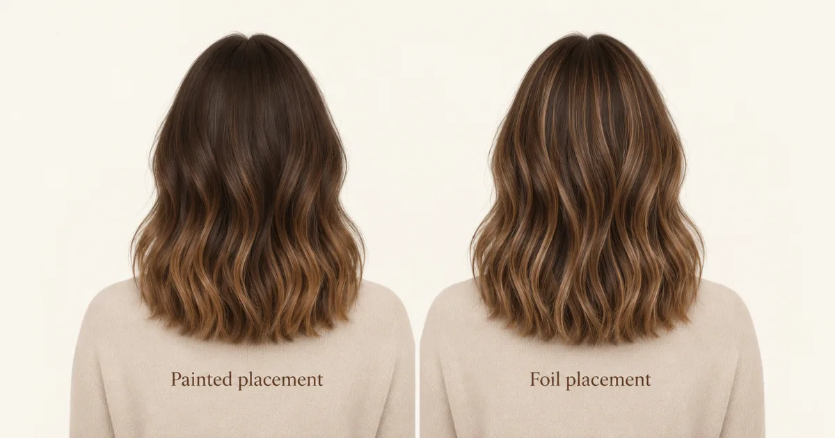
Generated editorial illustration of two conceptual placement examples, not Naee output or a real transformation. Either approach can be adapted beyond these examples.
The technique name alone does not settle brightness, warmth, price or upkeep. A softly blended foil result and a strongly contrasting painted result are both possible. A useful reference describes the effect you like rather than treating the service label as a promise.
Publisher disclosure: This is the Naee blog, and we have a commercial interest in Naee. Salon explanations cited here inform the terminology, not a universal treatment plan. We have not performed a salon comparison or an independent color-preview accuracy test. All images are original generated editorial illustrations, not client photographs or app results.
Contents
- Balayage vs highlights: effect and technique
- Compare root transition, not a maintenance promise
- Choose brightness and contrast deliberately
- Face framing and curls change what you notice
- Hybrids make the labels less absolute
- What a virtual color preview cannot prove
- Bring a keep-change-check colorist brief
- FAQ
Balayage vs highlights: effect and technique
Dellaria Salons' explanation makes the key distinction explicit: highlights refer to hair lighter than its base, while balayage describes freehand application. Highlights are not restricted to blonde hair. A brunette with lighter brown ribbons also has highlights.
In conventional foil highlighting, selected strands are isolated using foil. Placement can bring lightness close to the roots and distribute it through the lengths. In typical freehand balayage, selected areas have a softer entry into brightness, often with more emphasis through the middle and ends. Those are common patterns, not requirements.
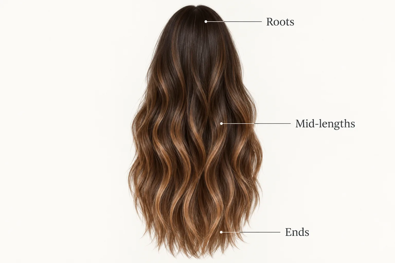
Generated editorial illustration. This conceptual freehand map shows staggered lightness, not an application lesson, chemical formula or guaranteed result.
Read the map in three zones. At the roots, notice how much of the deeper base remains. Through the mid-lengths, notice where separate lighter ribbons become visible. At the ends, notice whether the hair stays dimensional or becomes predominantly lighter. This vocabulary is more precise than asking for something simply “natural.”
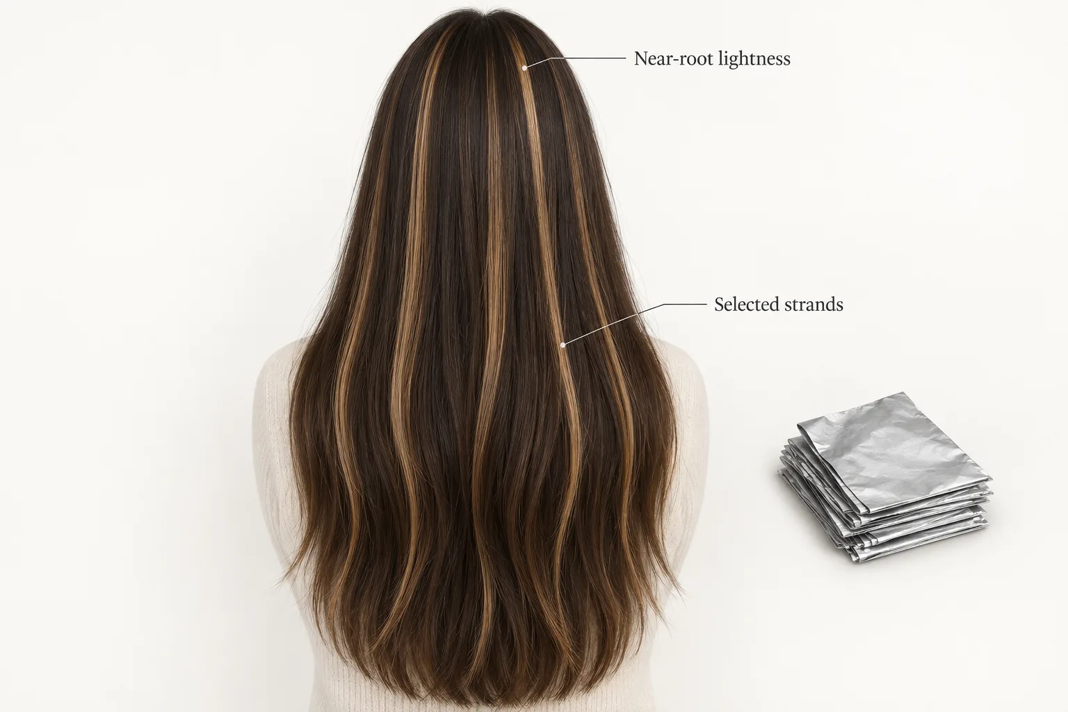
Generated editorial illustration of one conventional foil-placement concept. The silver shapes symbolize isolation, not a chemical procedure. Foil results need not be stripy or high contrast.
The foil example keeps darker hair between the lighter pieces. It does not represent all-over lightening. Section size, distribution, tonal contrast and blending can change how distinct those pieces look. Ask a colorist to point out these features in your reference rather than identifying a method from the finished photograph alone.
Compare root transition, not a maintenance promise
The reason a deeper root area can appear more forgiving is visual: new growth meets an existing deeper zone rather than a conspicuously lighter boundary. A softer transition may make that meeting point less noticeable. It does not stop growth or prevent the lighter lengths from changing tone.
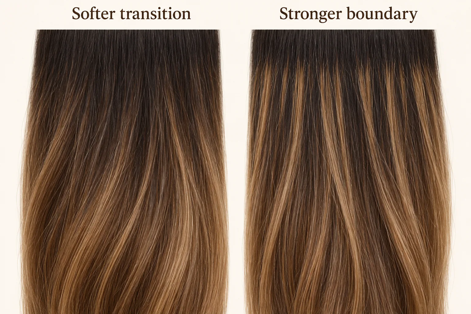
Generated editorial illustration. Equal conceptual new-growth zones show differing boundary contrast, not a timeline or proof of how either service will grow out on you.
Salon 833 and Trademark Salon describe balayage as a lower-upkeep choice. That can describe an intended soft-root effect, but it is not a fixed appointment schedule. Bright front pieces, the selected tone, previously colored lengths and your tolerance for visible regrowth can still create reasons to return.
Wella's explanation also separates placement from tone: lighter pieces close to the roots can need attention sooner, while the tone on lightened pieces can change even when the placement still works. Its quoted intervals are not a schedule for your hair, so this guide does not use them as guarantees.
Separate three questions when discussing upkeep:
- Root contrast: How will new growth meet the chosen placement?
- Tone: What changes in warmth or fading might you notice in the lightened areas?
- Preference: Which change would make you want a refresh, even if the overall placement still looks acceptable?
Tell the colorist how often you are realistically willing to return and what bothers you first: a darker line, warmer ends or a fading face frame. Ask for a plan adapted to that tolerance. Do not interpret “lived-in” as “no future appointments,” and do not assume every foil service needs the same refresh frequency.
Choose brightness and contrast deliberately
Brightness is how light an area looks; contrast is how different it looks from the surrounding hair. A few light pieces against a deep base can look striking even when most of the head remains brunette. Many fine pieces can make the overall appearance lighter while each individual ribbon is less obvious.
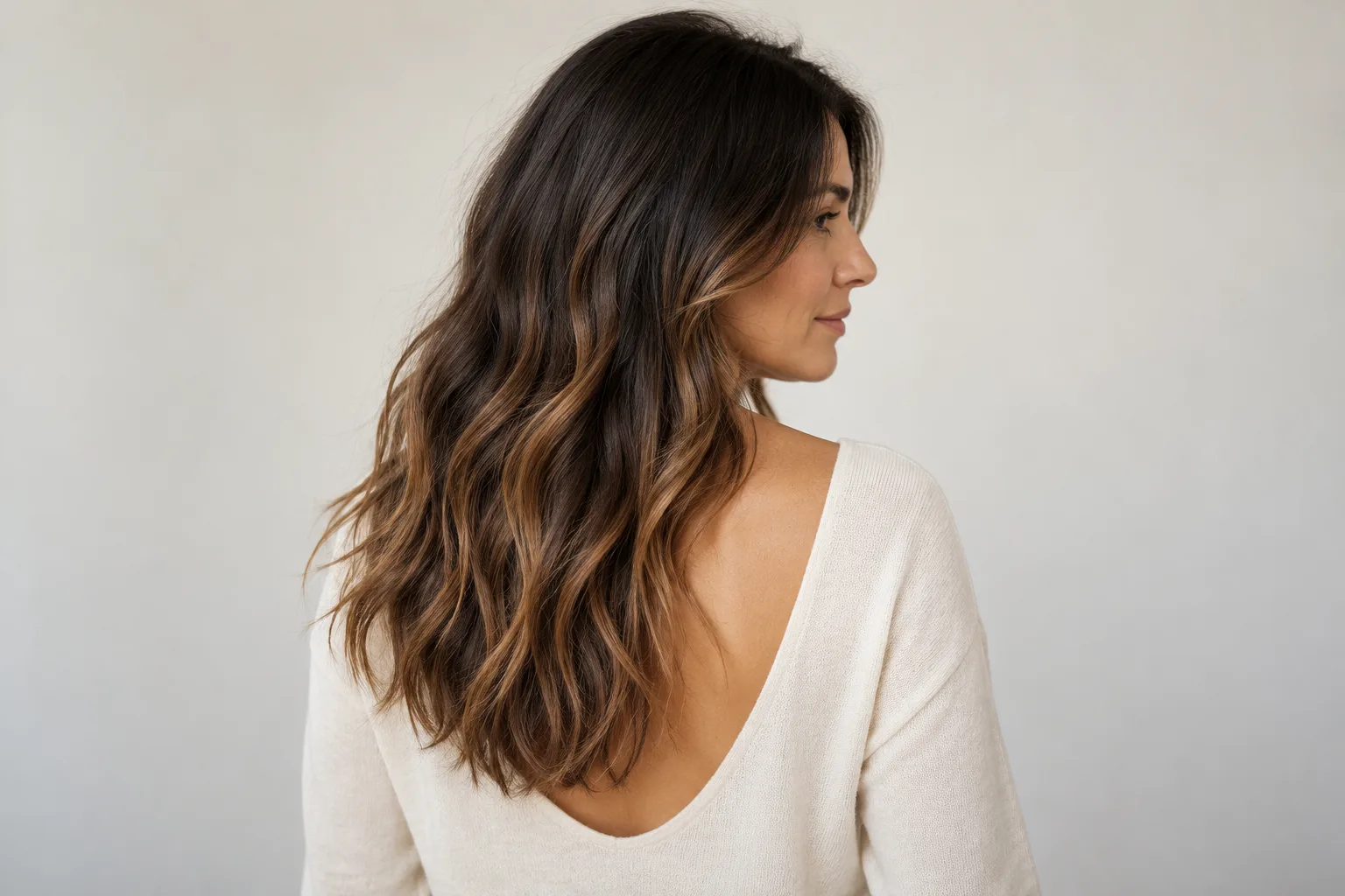
Generated editorial illustration, not a client portrait or salon result. This conceptual brunette example keeps substantial depth while using softly placed lighter ribbons through the visible lengths.
Use the portrait to name what you like: a deeper crown, warm lower-length ribbons or retained dark space between pieces. Do not assume its glossy wave finish comes with the color. Styling and lighting affect how visible the dimension looks.
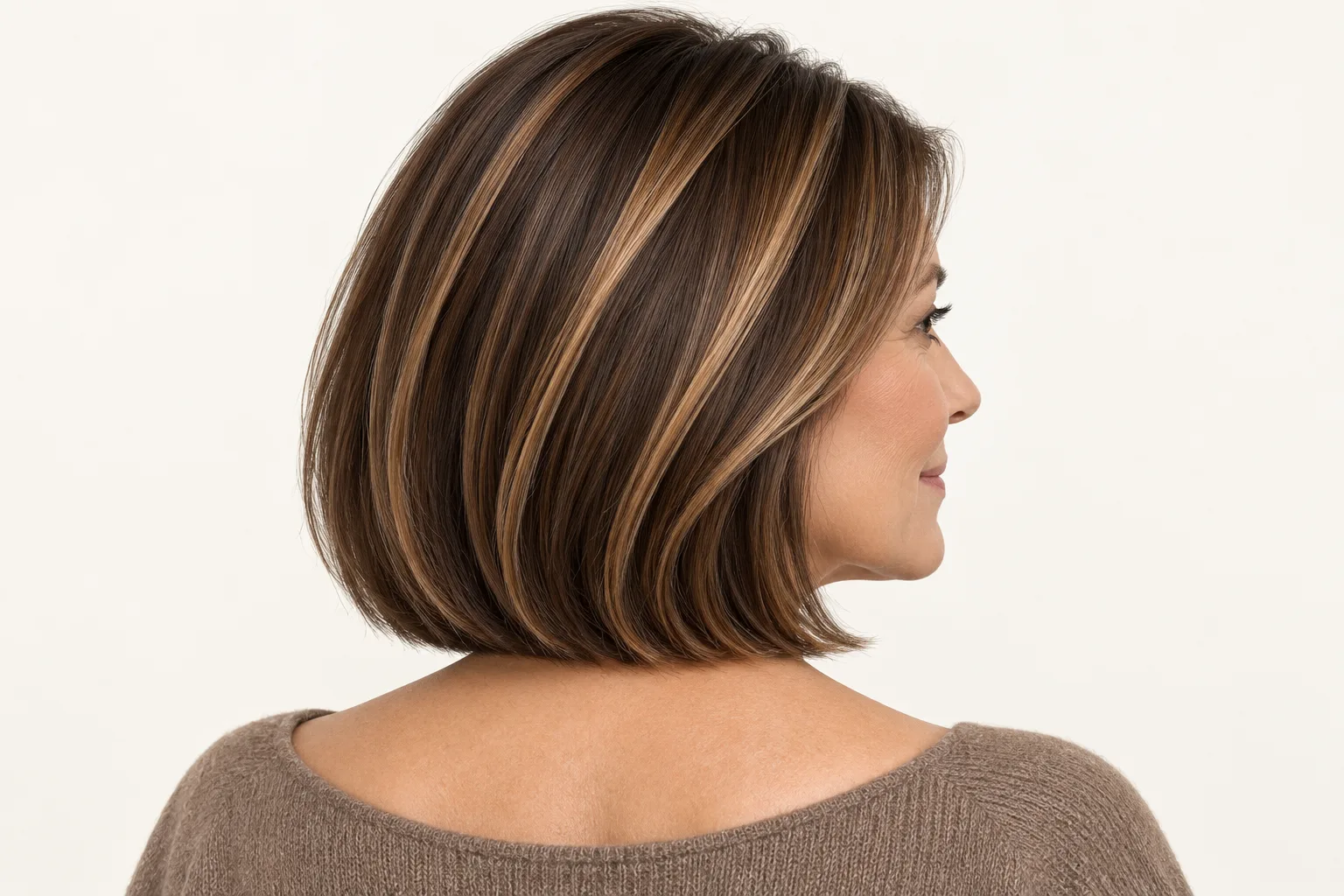
Generated editorial illustration of a possible higher-contrast foil-highlight effect, not proof that all foil placement looks like this or that your hair can reach this tone.
The second example uses more conspicuous light-dark separation near the upper lengths. If that is your preference, say so. If you dislike those visible ribbons but want upper-area brightness, ask about finer placement and softer contrast instead of rejecting foil work altogether.
| Your priority | Placement worth discussing | Why it can help | What still needs checking |
|---|---|---|---|
| Retain a deeper crown | Painted, lower-focused lightness or another soft-root plan | Keeps more visual depth near new growth | Whether your reference also has bright front pieces requiring attention |
| Brightness closer to the part | Fine foil placement near the roots | Distributes selected lighter strands through the upper area | The boundary you will see as hair grows |
| Noticeable separated ribbons | More contrast between base and selected pieces | Makes dimension easier to see | Whether you like that contrast with your everyday finish |
| A subtler overall change | Fewer pieces, gentler tonal contrast or finer distribution | Limits how much the base appears to change | Whether the effect is visible enough to meet your goal |
| Less tolerance for frequent refreshes | A deeper, softly blended root transition | May reduce visible boundary contrast | Tone upkeep, front-piece brightness and your personal refresh trigger |
| Previously colored or uneven lengths | A consultation before choosing the service name | Lets the plan start with real color history | Feasibility, condition, quote and possible staged expectations |
The table is a conversation guide, not a prescription. Start with the outcome you can describe, then let the colorist assess the method. For shade vocabulary, our hair color inspiration guide gives names for different directions; a shade name alone does not define its placement or upkeep.
Face framing and curls change what you notice
Brightness around the face can draw attention even when most of the hair stays deep. That makes a face frame worth discussing separately from the rest of the head. Decide whether you want an obvious front ribbon, a gentler scattering of lighter pieces or very little front contrast.
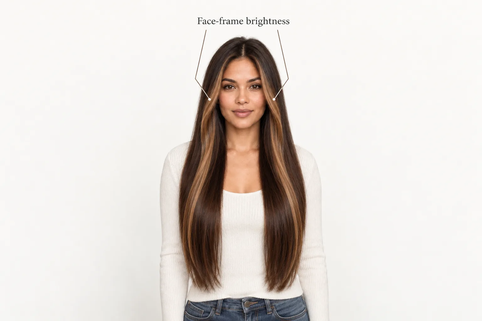
Generated editorial illustration of conceptual face-framing color placement, not haircut layers, a Naee output or an actual transformation.
Ask where the front brightness should begin and how it connects to the surrounding lengths. A dramatic front piece may remain a refresh priority even with a soft-root effect elsewhere. The technique used on the rest of the hair does not automatically answer that question.
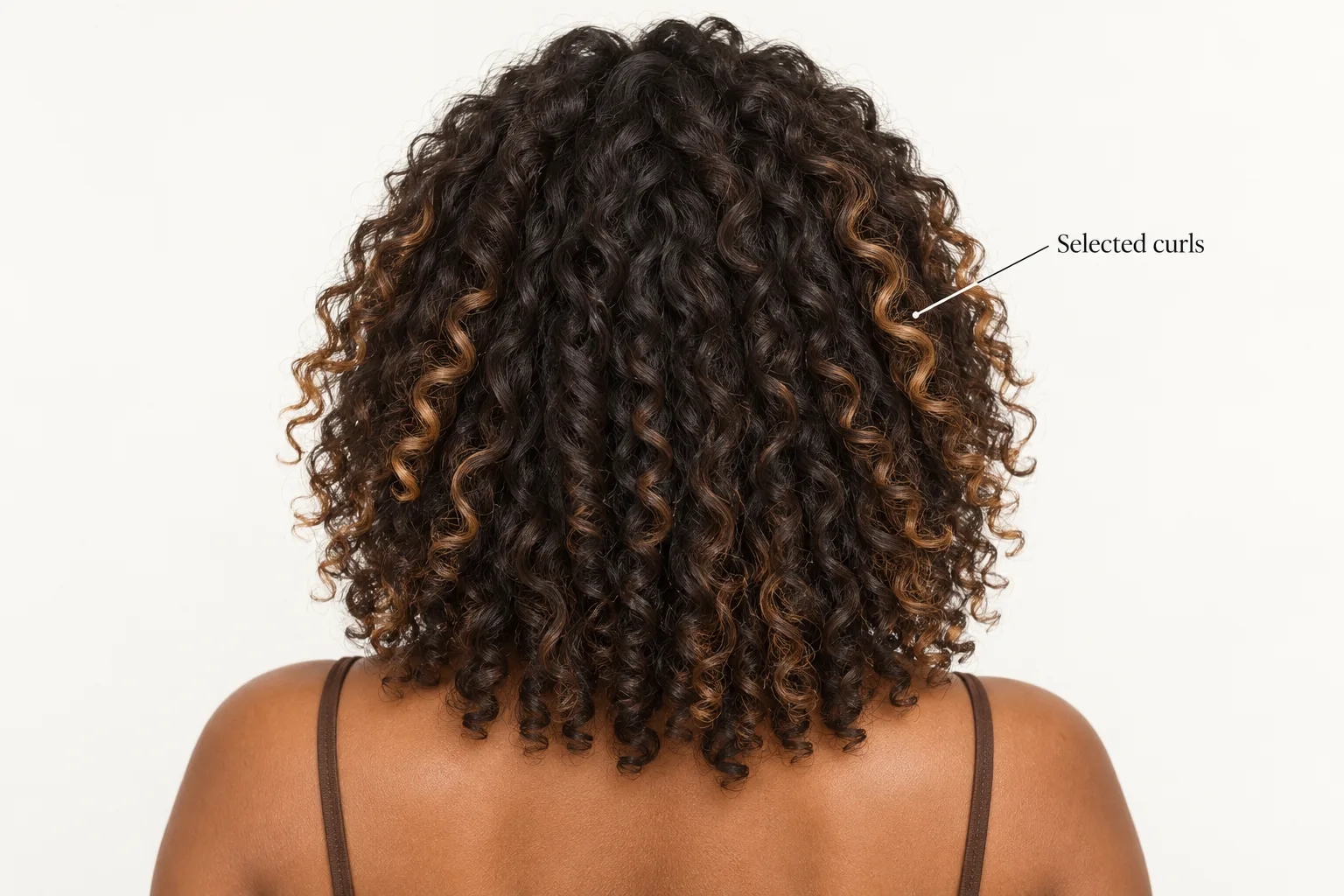
Generated editorial illustration. Selected lighter curl clumps show a conceptual placement idea, not proof of a chemically feasible color or a prediction of your curl pattern.
On curls, a ribbon follows bends and can disappear behind another curl. Discuss the color with your usual dry shape visible so the reference is not judged only on stretched or straightened hair. Ask how the visible pieces would be distributed around the outer silhouette and face.
For waves, the same principle applies: movement changes which surfaces catch the light. Our guide to wavy hair and everyday shape explains why the usual finish matters when choosing a reference. Neither a texture label nor an attractive photograph can establish the condition of your own hair for lightening.
Hybrids make the labels less absolute
A colorist may combine approaches: softer painted placement in some areas, foil-isolated brightness elsewhere, or a blended root treatment to change the transition. Wella Professionals' balayage guide calls a combination of freehand placement and foil isolation foilyage. Service names and inclusions vary between salons, so ask what a proposed package actually means.
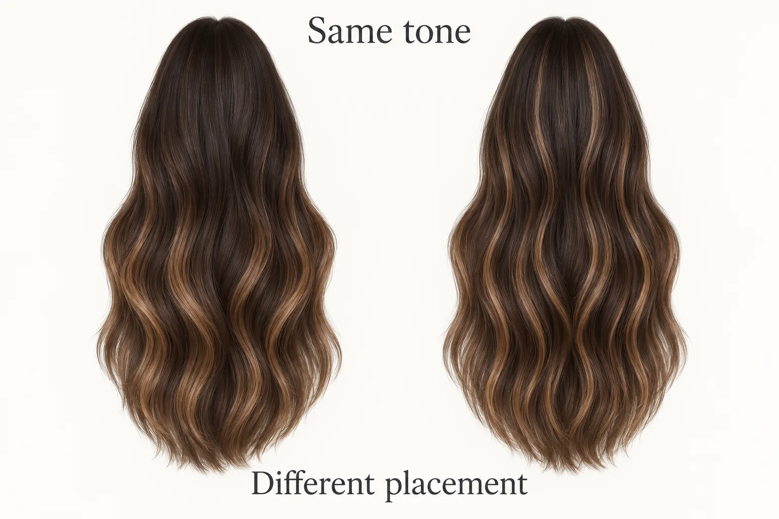
Generated editorial illustration. These matched conceptual swatches hold the color direction constant to show differing placement, not real before-and-after results or app previews.
Here, the caramel tone is intentionally similar. The difference is where it starts and how much deep base separates the pieces. This is why a single reference cannot reliably tell you whether its finished effect came from freehand painting, foils, a hybrid or additional blending.
Trademark's explanation discusses customization within highlighting, but some of its broader claims about darker hair and maintenance are too absolute to use as selection rules. Likewise, Salon 833's preference for naturally lighter starting hair should not become a universal ban on brunette balayage. Your own history and desired degree of change matter more than a blanket “best for” statement.
Instead of booking by a label you are unsure of, ask: “Can you explain how you would create this placement on my starting color, and what part of the picture you would change?” This leaves room for the appropriate method without surrendering your visual preferences.
What a virtual color preview cannot prove
A virtual preview can help you compare deeper roots with brighter upper lengths, warm with cooler-looking tones, or a stronger face frame with a quieter one. It cannot prove that a particular lightness is achievable, assess previous color inside the hair, establish a chemical process, quote a salon price or determine an appointment count.
The official Naee App Store listing, checked October 11, 2026, describes own-photo hair-color previews and Stylist Mode. Treat those as visual exploration features, not a professional assessment of lightening feasibility. A believable rendered blonde is still generated pixels.
For a more useful comparison, keep your source photograph, cut, part and intended shade direction the same. Compare only two placement ideas: one with deeper roots and lower-focused lightness, another with selected brightness closer to the roots. Then check whether the generator also changed your face, texture, haircut or lighting. If it did, the preference may not be about placement alone.
Our hair color preview guide covers the broader photo and shade workflow. If you are borrowing a reference, the reference-photo adaptation guide explains why matching an idea is different from reproducing every detail. Keep the original hair photo beside any preview so the colorist can separate your real starting point from the generated suggestion.
Naee is a free iPhone download, not a promise of unlimited free generation. The listing describes limited trial credits and a subscription or credit purchase for continued use. Check current in-app terms before making repeated variations. Nothing in this article is presented as a tested Naee placement result.
Bring a keep-change-check colorist brief
A good brief starts with the hair you have, not just the picture you want. Describe prior salon and at-home color, previous lightening, smoothing services and any areas you are concerned about. If you do not know a product or date, say that rather than guessing. The colorist can decide what further assessment is needed.
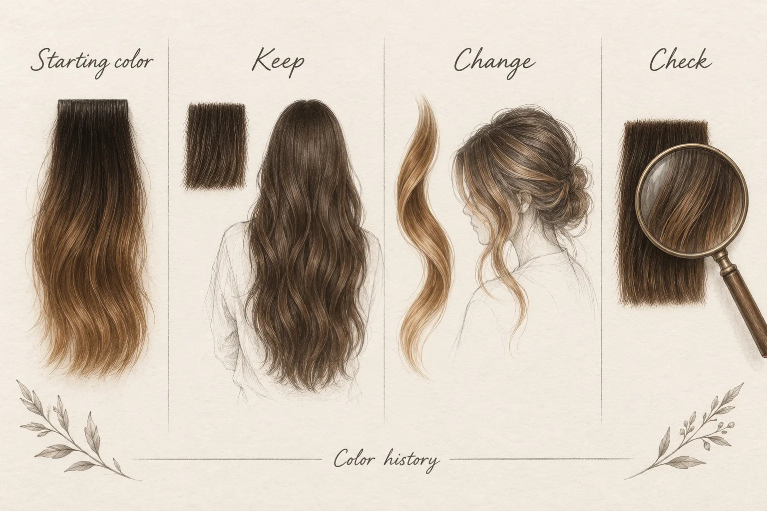
Generated editorial illustration of a conceptual consultation brief, not an app analysis. The prose checklist below contains the actual questions; the swatches do not diagnose hair condition.
Copy and adapt these notes:
- Starting point: My natural root color, current lengths and known color or lightening history are ___. Here is an unfiltered photo in even light.
- Keep: I want to retain ___, such as a deeper crown, my current length or visible dark dimension.
- Change: I want more brightness at ___, with ___ contrast and a ___ tone direction.
- Check: Is this reference realistic on my starting hair? What would you adapt, and what cannot be promised?
- Upkeep: The change that would bother me first is ___. My realistic salon-return preference is ___. What upkeep would this placement involve?
- Scope and quote: Which services are included, what might need a separate visit, and what can you estimate after assessing my hair?
Hypothetical example, not a client case: Leah has dark brunette roots, warmer previously colored ends and loose waves. She likes the brighter face frame in one picture but wants the deeper crown in another. She can bring both and say: “Keep the crown depth and my length. Change the front brightness and soften the transition into the ends. Check what my previous color allows before we choose a technique.”
If the colorist proposes a hybrid, Leah asks how it serves those specific goals. If the requested shade is not a responsible target, she asks for a softer contrast or an adjusted tone rather than treating the preview as evidence that it must work. Her shortlist is a visual brief, not an instruction to reproduce every pixel.
The takeaway: Choose the placement and transition you want to live with, then choose the method with a colorist. If a visual comparison would help you describe that preference, you can download Naee for iPhone. Bring the original photo, generated ideas and your keep-change-check notes together.
FAQ
Is balayage the same as highlights?
No. Highlights describe strands lighter than the base color. Balayage describes a freehand technique that can produce highlights. When a salon compares “balayage” with “highlights,” it often means freehand placement versus conventional foil placement. Confirm the service details rather than relying on the shorthand.
Does balayage always require less maintenance?
No. A deeper, softer root transition may make new growth less conspicuous, but tone, bright front pieces, color history and your preference still affect refresh needs. Ask separately about root contrast and maintenance of the lighter lengths. There is no universal interval promised here.
Can foil highlights look soft rather than stripy?
Yes. Fine distribution, lower tonal contrast and blending can produce a softer effect. Foils describe isolation and application, not one mandatory pattern. Show the degree of contrast you want and ask how the proposed placement supports it.
Can brunette or curly hair have balayage?
The technique name alone does not rule out brunette color or curls. Starting color, previous services, hair condition and desired brightness still need professional assessment. Discuss the placement on your usual dry texture; a generated example is not proof that a particular tone is achievable.
Can an AI preview tell me which color service to book?
It can help you explain a visual preference, but it cannot assess chemical feasibility, the appropriate process, price or appointment count. Use a preview alongside an original photo and color history. Let a colorist assess the real hair before finalizing the service.